
Using Tableau, we were able to capture the trends of endowments, mobility rates, and the type of school all within one graph. In this section of the project, we are focusing on major public and private schools that are nationally ranked as top tier schools:
Public
- UCLA
- UC Berkeley
- University of Virginia
- University of Michigan
- UNC Chapel Hill
- College of William and Mary
- Georgia Institute of Technology
- Texas A&M
- University of Florida
- University of Texas System
- Ohio State
- University of Wisconsin- Madison
Private
- Princeton
- Harvard
- University of Chicago
- Yale
- Columbia
- Stanford
- MIT
- Duke
- University of Pennsylvania
- Johns Hopkins
- Emory
- Vanderbilt
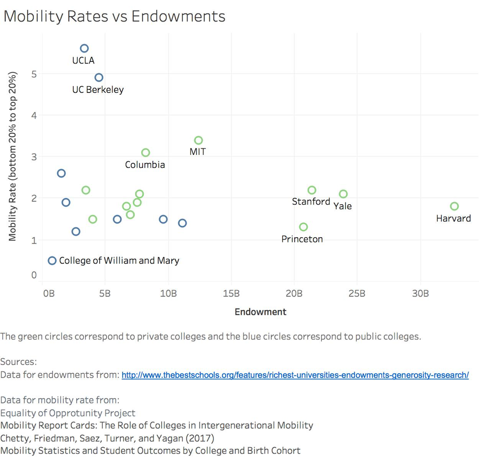
Shiven did a great job incorporating all of the factors we decided to focus on. The green circles represent private colleges while the blue circles represent public colleges. The mobility rate involves the students in the bottom 20% moving to the top 20%. There one major trend occurring. The private schools seem to be correlated with a larger endowment while public schools are associated with smaller endowments. This was a trend we predicted and did not find that surprising. Another trend we saw is that the public schools tended to have lower mobility rates than the private schools, but this trend was not as obvious or strong. Rather, the public schools had a wide range of economic mobility. The private schools on the other hand, stayed within a similar range of mobility rate, regardless of their endowments. Even though public schools tended to have a smaller endowment, when compared to private schools of similar endowments, the public schools sometimes had higher mobility rates than private schools. Again, this is not a strong correlation but it is an interesting point we found in this data. With respects to endowment vs mobility, suprisingly enough we found that in the top tier schools across the nation, those with lower endowments had higher economic mobility.
Something that took our interest immediately was the two blue outliers: UCLA and UC Berkeley. They have rather small endowments compared to the other schools in this analysis, yet their mobility rates exceeded all others, including Harvard with a whopping $32.7 billion a year. We were aware of the California public school system and that their public schools surpassed many other private schools in other states, but we would not have guessed the success of its students was greater than Ivy League schools.
This data now allows us to explore these outliers. First is Harvard, which rakes in 32.7 billion dollars each year, but only has a mobility rate of 1.8%. Second is the UC school system, specifically UCLA and UC Berkeley. Only given about 1/10th of Harvard’s endowments, their mobility rate is 5.6% and 4.9% respectively. It brings into question where these endowments are allocated. Are they given back to the students? Or are they spent elsewhere?