
Warning: Attempt to read property "ID" on null in /home/davidmor/eoop.davidmorgen.org/wp-content/plugins/subscribe-to-comments/subscribe-to-comments.php on line 194
Why?
The Equality of Opportunity project is hugely successful at answering the statistical questions. For example, it is immediately evident from the EOOP home page which colleges and universities provide the highest upward mobility. The more difficult question, however, is the one that numbers cannot answer: why? The EOOP has rightly left this challenging query for others to answer.
To answer this question, individuals must first determine the cause of differences in upward mobility. The origin of this discrepancy can partially be explained by EOOP data. One might assume that due to the nature of upward mobility the colleges with the best rankings or highest low-income student enrollment would have the highest upward mobility. However, this assumption is shockingly incorrect. From the U.S News and World Report’s National University Rankings, we see that none of the top 60 ranked universities in the United States are in the top five of upward mobility. Also, the New York Times article ‘Some Colleges Have More Students From the Top 1 Percent Than the Bottom 60. Find Yours.’ shows that none of the top 10 Elite colleges that enroll the highest percentage of low- and middle-income students are in the top five of upward mobility. The most logical explanation for these trends is that the Nation’s best universities are great at moving students into the top income brackets but are unlikely to accept low-income students. In contrast, colleges that are likely to accept the most low-income students are not the best at moving students into the top income brackets.
Even if this possible explanation is correct, it again raises the difficult question of ‘why.’ Why are the top universities unlikely to accept low-income students, and why are colleges with many low-income students unlikely to move students into the top income brackets? Unfortunately, the dearth of information easily available makes working in hypothetical scenarios the only way to tackle this prevailing problem. One possible answer that could be easily studied with the appropriate data is that fewer low-income students apply to top universities. Although this data is not currently available, two possible hypothetical situations have been provided for analysis. The first scenario is that many low-income students apply to prestigious universities proportionally, but only a few are admitted. In this case, the data could be depicted in a graph similar Figure 1.
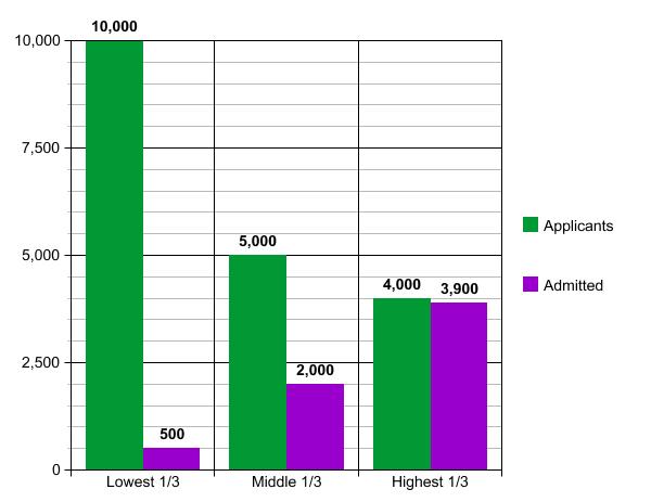
It is clear from the graph in Figure 1 that students from the lowest 1/3 of income brackets are much less likely to be admitted to a top university even if they apply at a higher rate. This would raise many questions about current high school education and college admission standards. The second hypothetical scenario is that fewer low-income students apply to these top schools. In this case, the data could be depicted in a graph similar Figure 2.

A chart like the one in Figure 2 would suggest a failure in the outreach programs of top universities to low-income students, making them unlikely to apply. Although the data and scenarios considered here are hypothetical, they show that the hard questions raised by EOOP are answerable when appropriate data is available.